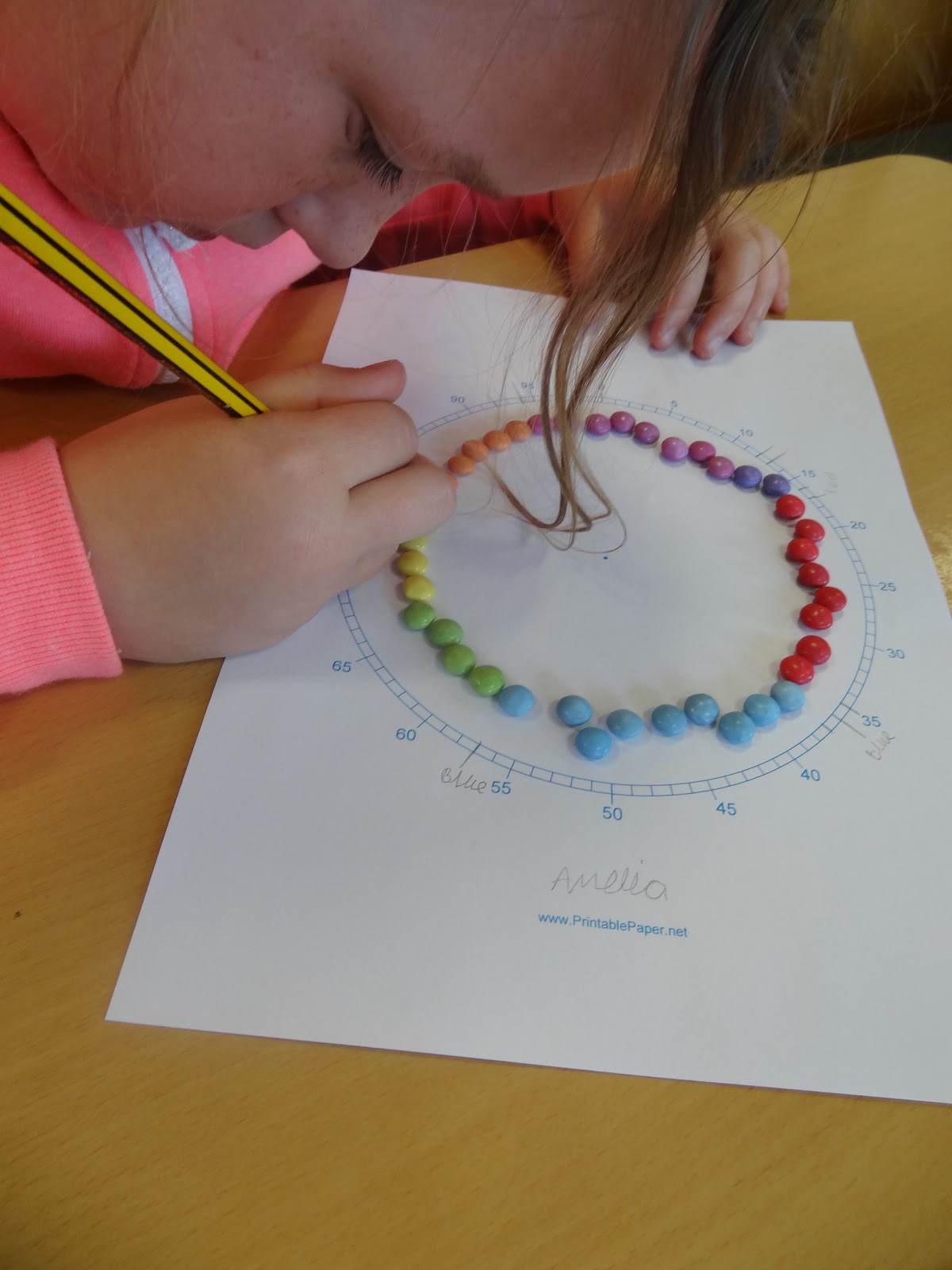
What a great way of doing pie charts! No arithmetic involved! Normally there is just a little too much involved in achieving a pie chart. How about we combine that with a circle divided into one hundred - then we simply have to count around that circle for the percentage! The paper was there on printablepaper.net.
So we handed out the boxes of Smarties.
We each had a packet, and sorted them into colours. Then we arranged them in a circle. That was the tricky bit. Sometimes we had to jiggle the circle quite a bit so all the Smarties would fit, and so it was fairly circular. We marked off the different colours on the outside circle divided into a hundred.
Then we coloured in the circle with the right colour, and added on some pie cuts:
It was great once again to do maths work together as Primary and Secondary, and thanks to Jim Noble for orgainising it all! He's already begun blogging about this piece of learning here.
Year 5 dived into it with enthusiasm. First of all we looked at how world population is growing, using this site. It was a bit of a shock for some of us to see how many people were dying, or even that people were dying! But also amazing to see how steadily the world population is going up! (Mind you, as Jose said, "They can know that exactly, can they?")
We had a look at a graph:
at which point Emily made a very apropos kind of cartoon noise that seemed to sum up the graph brilliantly - a long trundle and then a sudden swannee-whistle ascent!
So, we were going to show all this, and lots more, with 100 students at IST. And first of all we were going to have to make huge map in the playground on which it would all be played out. We got some A3 world maps:
and set off. Matt Podbury (who's blogged about this too!) was there with two of his Year 12 geography students to help us, and using the lines of longitude and latitude to guide us we copied the map, cell by cell, onto the tarmac using chunky chalks.
We got it done just in time for all the classes to assemble around the map:
(You can see Mr Noble up on the roof with the cameras.)
And so began our mapping:
After we'd shown population growth, we enacted some statistics for the people in the world. Like, "What proportion have a college (university) education?"
That person leaping:
is the one out of a hundred that has a college education. (When we looked at this the next day, all of us found it surprising how few people in the world go to college!)
Another one was, "If the world were a village of 100 people, how many would have a computer?"
You can see the ones with computers sitting on the left. When we talked and wrote about this in class the next day, Emily wrote, "Surprisingly, out of 100 people, 7 have computers and 93 don't." It wasn't such complete news to Jessica though. She wrote, "I wasn't surprised because all over the world people don't have enough money to buy computers, however I wasn't expecting that only seven people out of one hundred have them."
There were a lot more thoughtful comments along these lines. Because we had acted out these diagrams, because we were in them, they were much more immediate. And talking about them, thinking about their meaning was a whole lot more interesting.
There were a lot more of these playground graphics, and you can see some of them on the blog posts I've linked to.